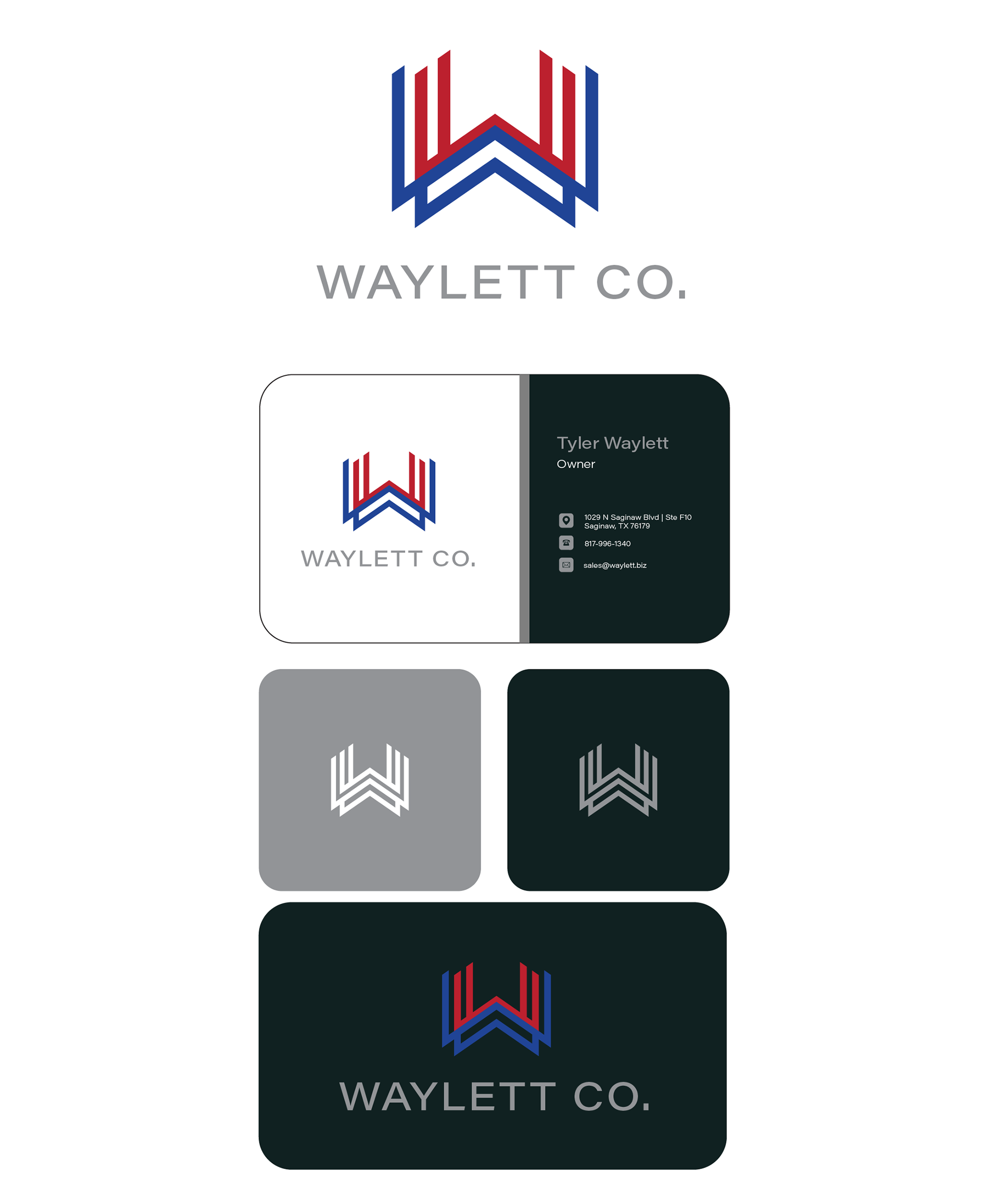
For the Waylett brand, the client sought a patriotic-theme identity for a family of brands, one that felt sleek, modern, and interchangeable across sub-brands.
In discovery I explored visual cues drawn from national symbolism—color, iconography, and flag motifs—while keeping an eye toward modern design treatment so the look would feel fresh and relevant. I sketched multiple logo options ranging from more literal patriotic symbols to abstract forms, and built mood boards combining bold color palettes, clean typefaces, and graphic elements that convey unity and versatility.
In developing the identity, I crafted a core mark that works well both on its own and paired with wordmarks, defined color relationships that allow flexible use (primary, secondary, accent), selected typography that balances strength and approachability, and produced mockups showing how the brand system performs across sub-brands, print, digital, and event collateral.
With refinement through feedback, the outcome is a brand that feels cohesive, confident, and adaptable—a visual system that supports the parent brand and its family of sub-brands while maintaining consistent quality and appeal.