


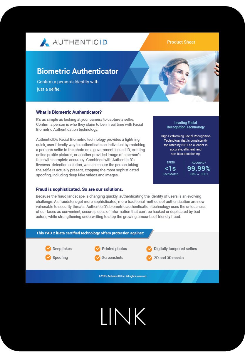
In designing the product sheets for the sales team, I wove the AuthenticID triangle into the header as a consistent visual anchor, reinforcing brand identity from the first glance.
My goal was to take often complex technical or product-heavy information and translate it into visual stories that are clear, organized, and compelling. To do that, I mapped out a hierarchy of content—key features, benefits, and use cases—then used graphical elements (iconography, color blocks, negative space) to guide the reader’s eye. Layouts balance clean typography with bold headers and concise bullets so sales reps can quickly scan, absorb, and confidently share.
The result: sheets that feel authentic to the brand, look professional, and help turn understanding into interest and action.